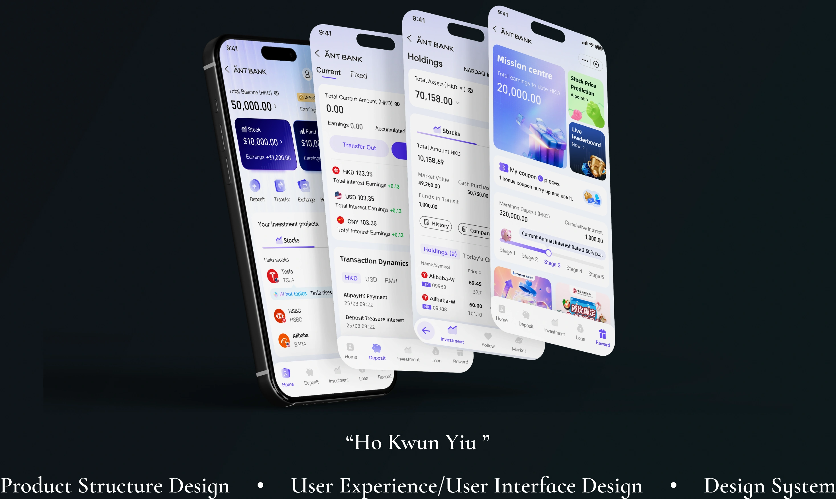
Accompanied by the addition of different businesses current planning has resulted in clients not being more effective in directly seeking out their relevant property
✦
Background
As the customer base grows, it is necessary to introduce a wider range of features to meet diverse customer needs.
202220,000 users
number of users1 million
2026
Business growth
The investment portfolio has expanded from only fixed-term and current accounts to include more investment categories such as funds and stocks.
time depositscreditTransfercurrent accountsFundsStocks
✦Background
As the customer base grows, it is necessary to introduce a wider range of features to meet diverse customer needs.
Unable to quickly browse their assets
81.8%
Need to switch between different pages
Quite difficult63.6%
Normal level18.3%
Not difficult18.1%
you expect to see assets right on the homepage?
81.8%
✦In-depth interview
A total of 11 users, aged between 25 and 35, had used the Ant Bank app within the past year.
It's not very convenient to check your assets.
The banner space fills the entire program.
The page is too long; I won't scroll down at all.
The product structure seems chaotic.
After recognizing the problem
Further exploration
Kelly Marketing 28 year old
financial managementinvest
Pain points
It's relatively difficult to quickly manage one's own assets, as the overall classification is quite scattered.
01
Log in to bank
02
Looking for my personal assets
03
You need to switch between different tabs to view it.
04
buying and selling operations
05
Finish
Hope I can quickly see my total assets.Where are all my balances and investments?Too many tabs make it hard to understand my asset status.I need clearer guidance before making a decision.Finish😐😐🫠🙂😖
✦Competitive analysis
After recognizing the relevant issues, we found that what our clients needed most was a quick overview of their relevant assets.
Based on user interviews and research, we should go further than traditional banks and current communication banks.
Location mapProactive Decision SupportSingle Function DisplayIntegrated Asset ManagementBasic Information Presentation
Strategy
To address the issues of fragmented asset categorization and the need for frequent page switching, the “Version B” update aims to evolve from a single-function entry point into a clearer, integrated wealth management experience.
Our goal is to help users quickly grasp the status of their personal assets and more efficiently view, compare, and manage their investments.
Strategy One: Integrate Asset Access
Consolidate cash, funds, investments, and transaction statuses scattered across different pages, allowing users to quickly view their overall assets in the financial management channel.
Strategy Two: Reduce Comprehension Difficulty
Reorganise the information architecture to clearly distinguish asset overview, holdings, returns, product recommendations, and transaction operations.
Strategy Three: Strengthen Decision Support
Incorporate clearer feedback on returns, risks, durations, liquidity, and statuses to help users make more confident decisions.
ObjectiveCreate a clear, unified financial management channel with decision support capabilities to help users manage their assets more efficiently and enhance the overall financial service experience.
Product Architecture
To achieve a better user experience and lower usability difficulty, we designed the core functions and service architecture based on the needs and pain points gathered from interviews.
Product Architecture
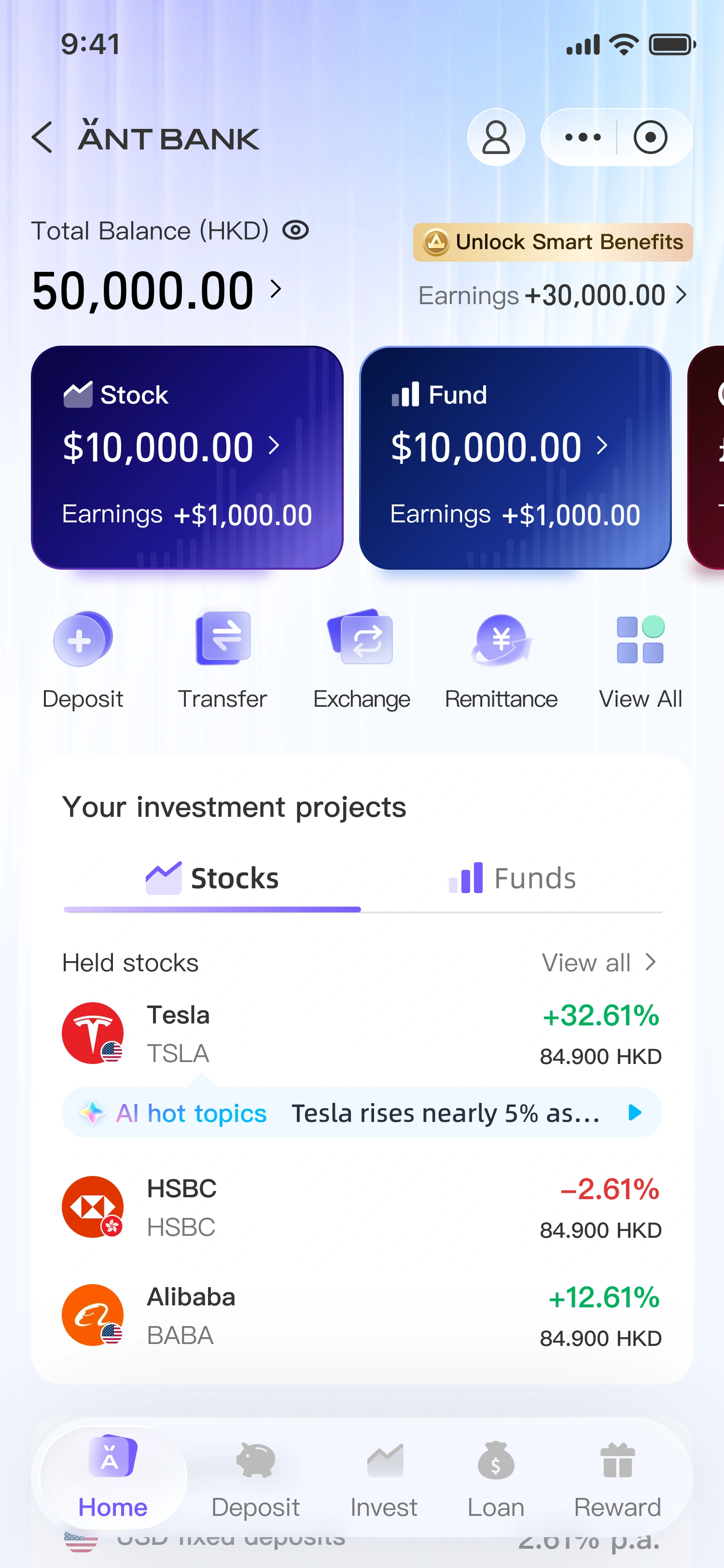
Home page
Asset StatusTotal Balance / Asset Overview Card
High Frequency OperationsFunction Entry Group Task Card
Home ContentInvestment Projects Deposit Services Recent Transactions
Extended ServicesCustomised Offers / Insurance
Deposit
In-page tabs:Current / Fixed
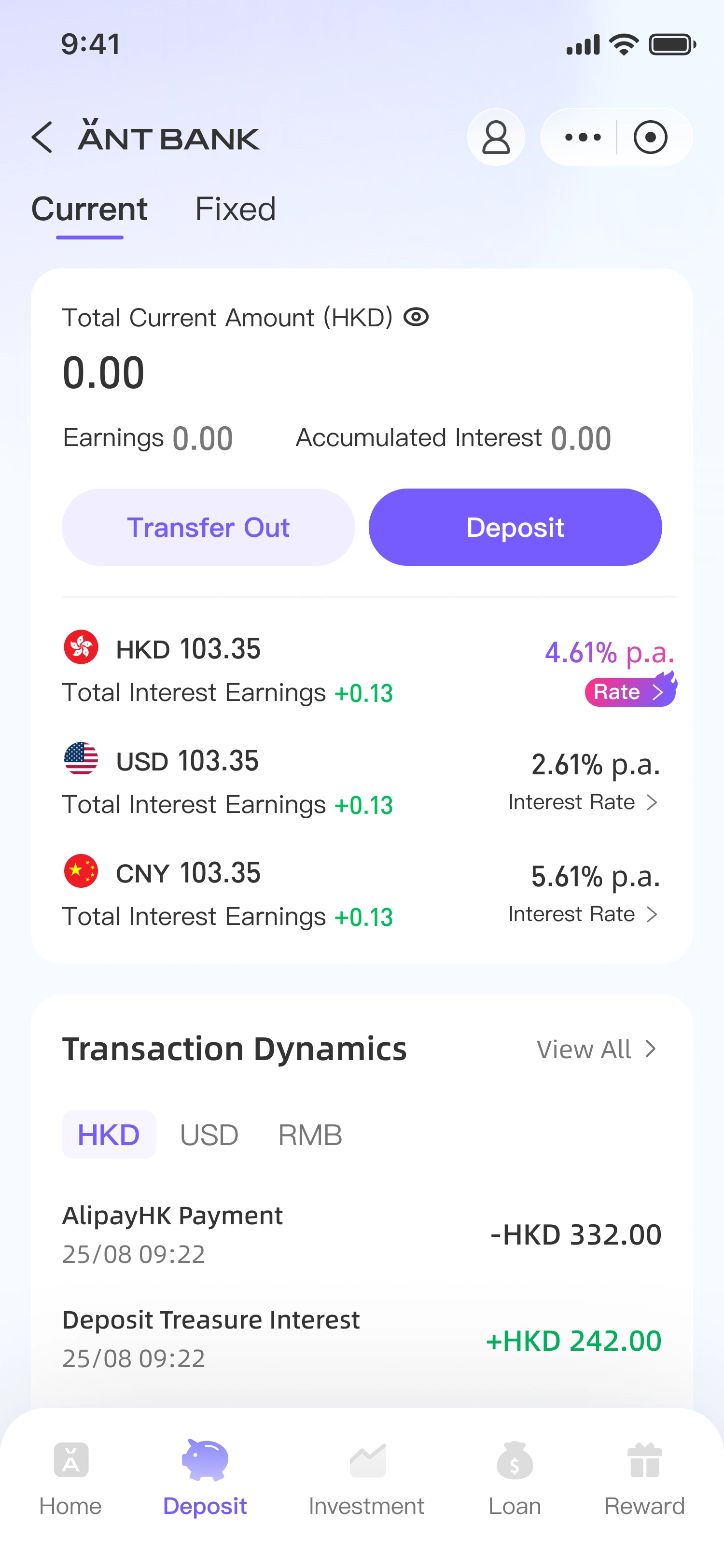
CurrentCurrent Total Card Transfer / Deposit Interest Service Entrance Transaction Dynamics Activity Banner
FixedFixed Total Card Open Fixed Deposit Fixed Deposit List / Historical Fixed Deposits Fixed Deposit Interest Rate Activity Banner
Investment
In-page tabs:Stock / Fund Shared Framework
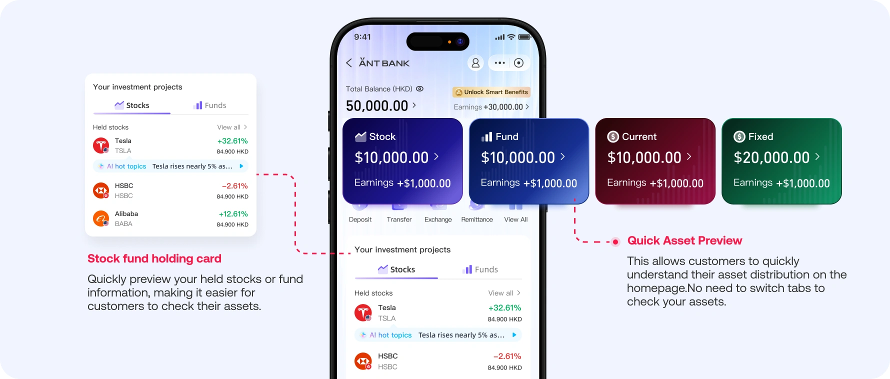
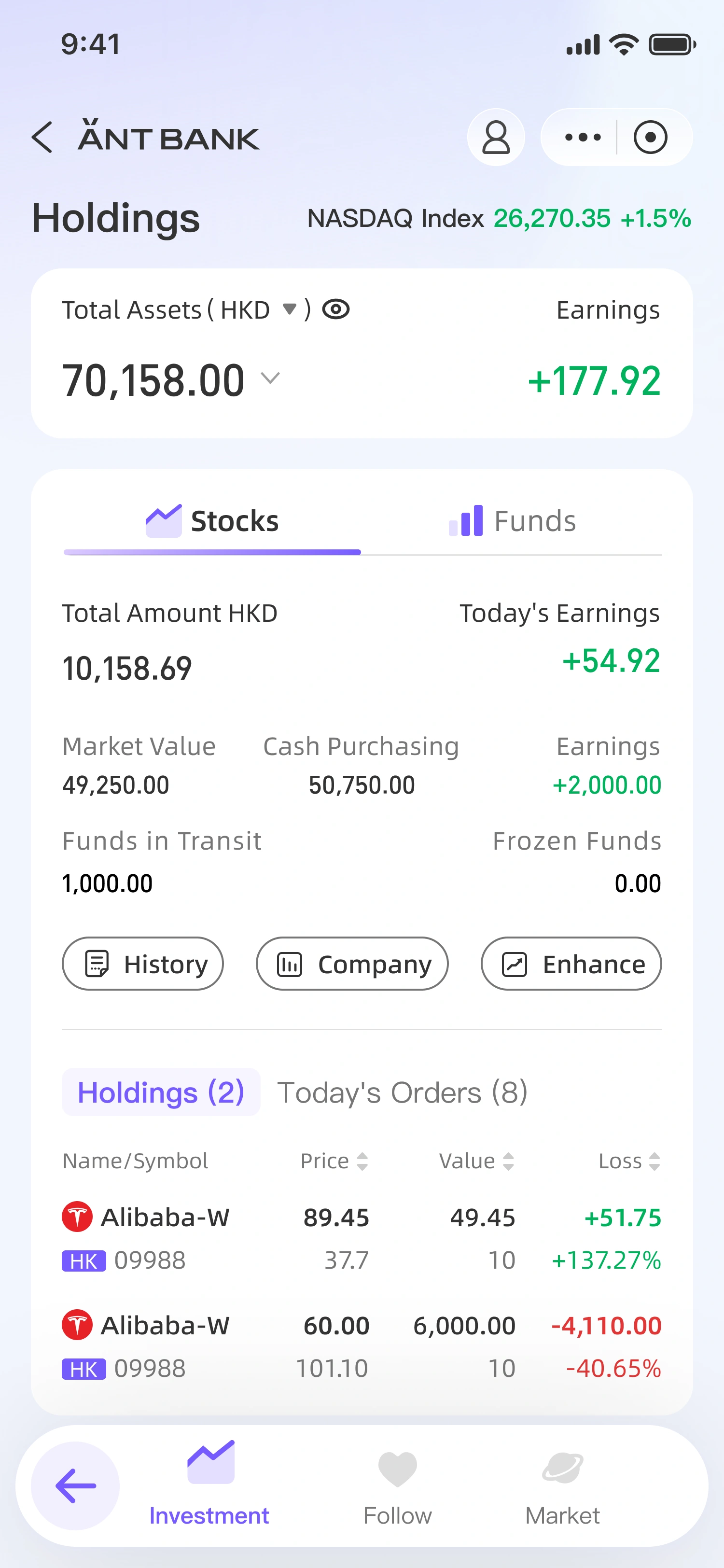
HoldingsTotal Investment Assets Switching Stocks/Funds Holdings List / Profit and Loss
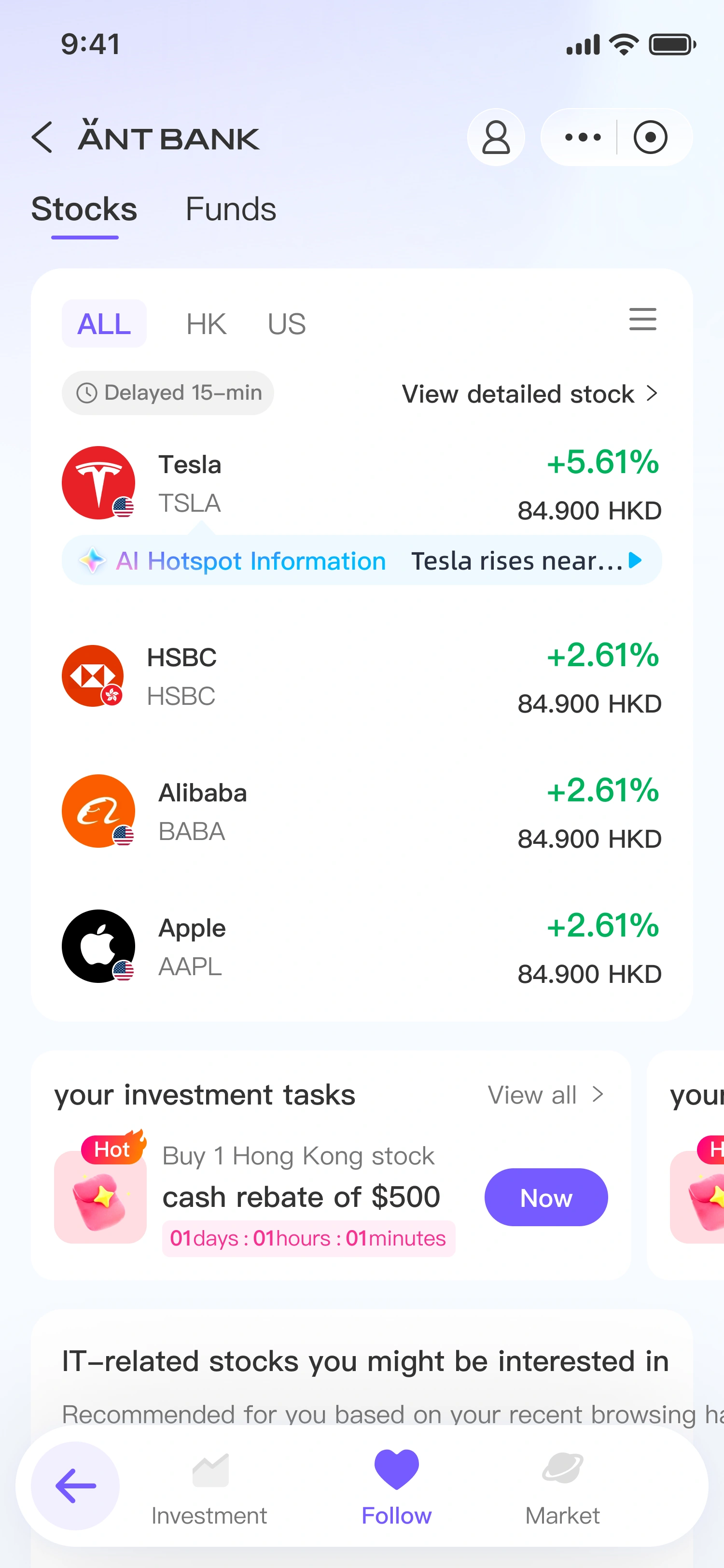
FollowFollow Stocks / Follow Funds Search and Detailed Entry Related Recommendations
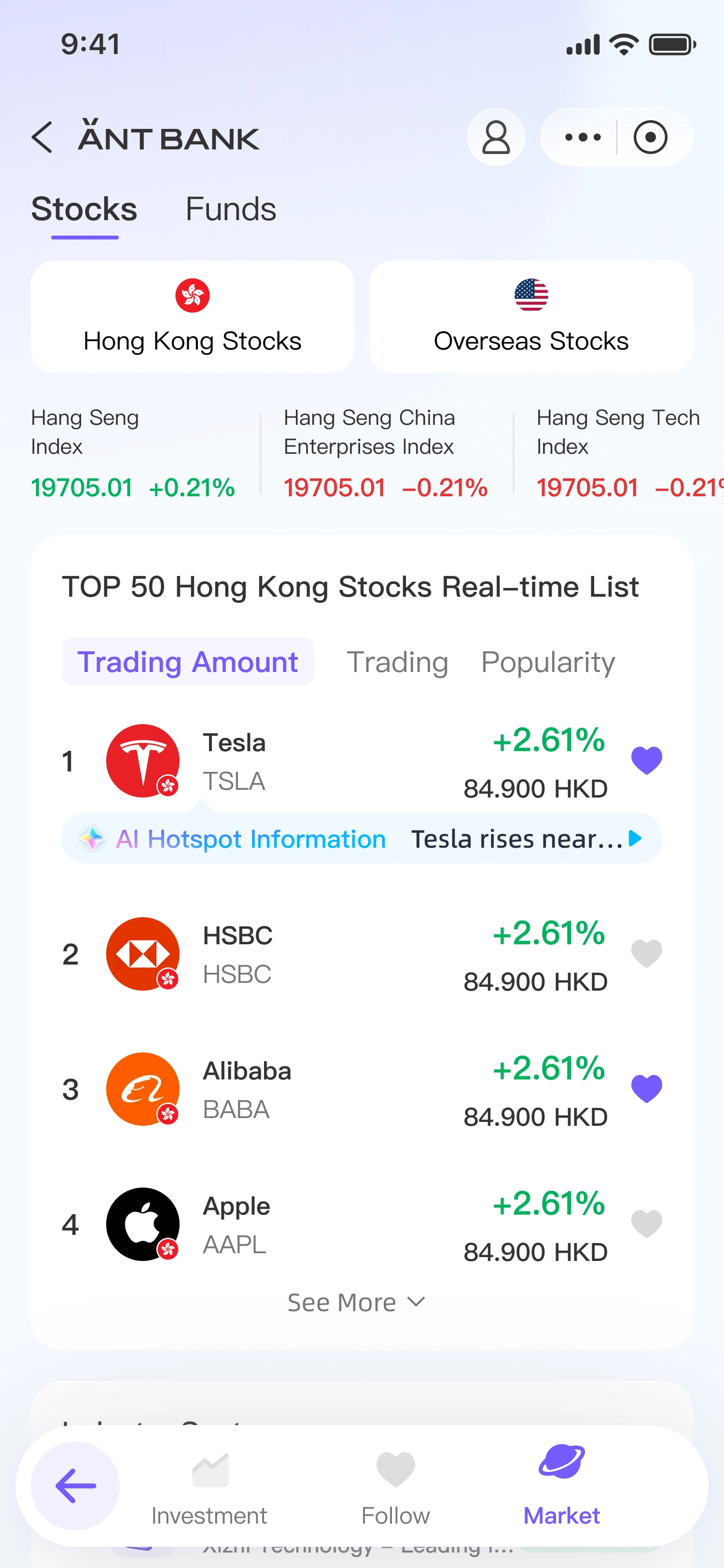
MarketHong Kong / Overseas Markets Market Indices / Top Rankings Performance Rankings / Thematic Funds
Loan productsPersonal loan PayLater Other loan cards
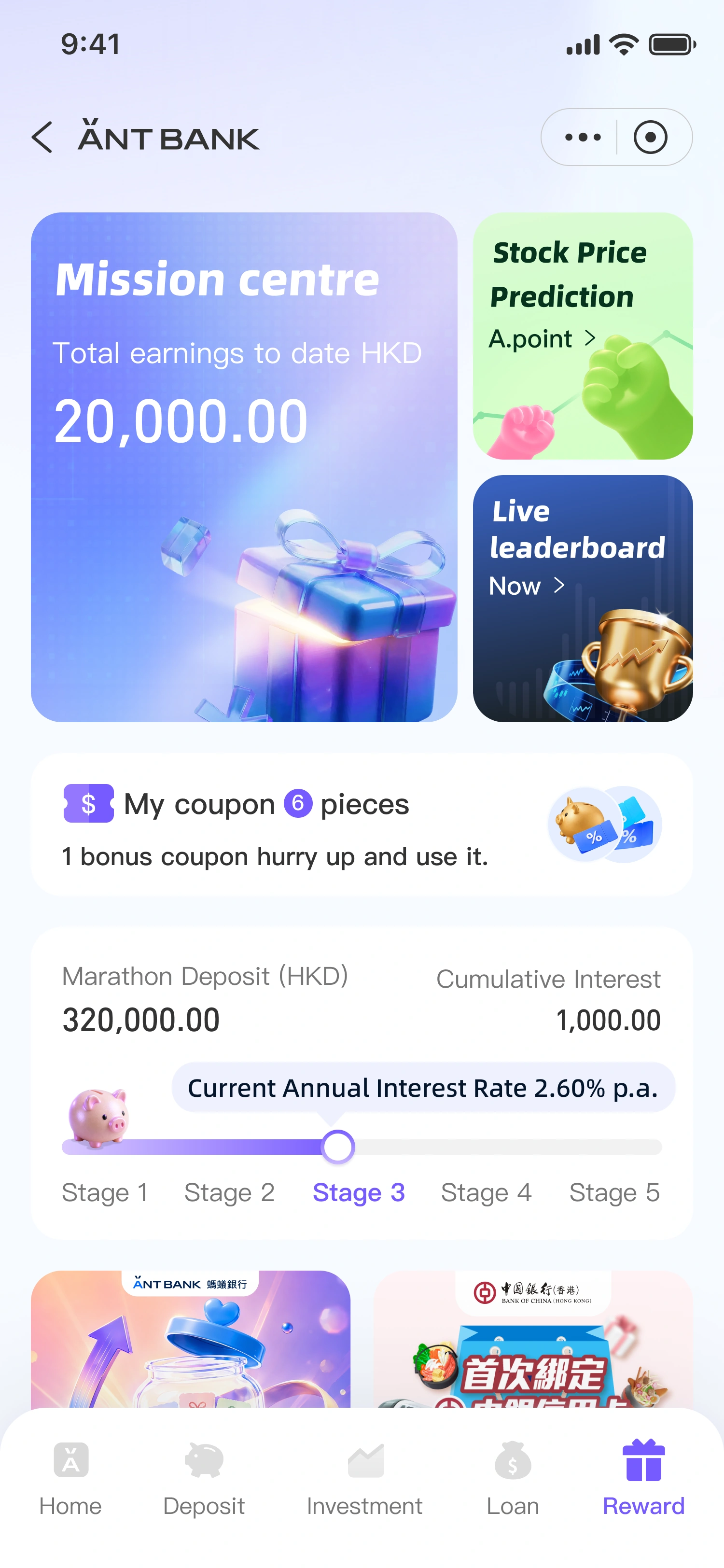
Reward
In-page tabs:Retention Entry / Benefits Centre
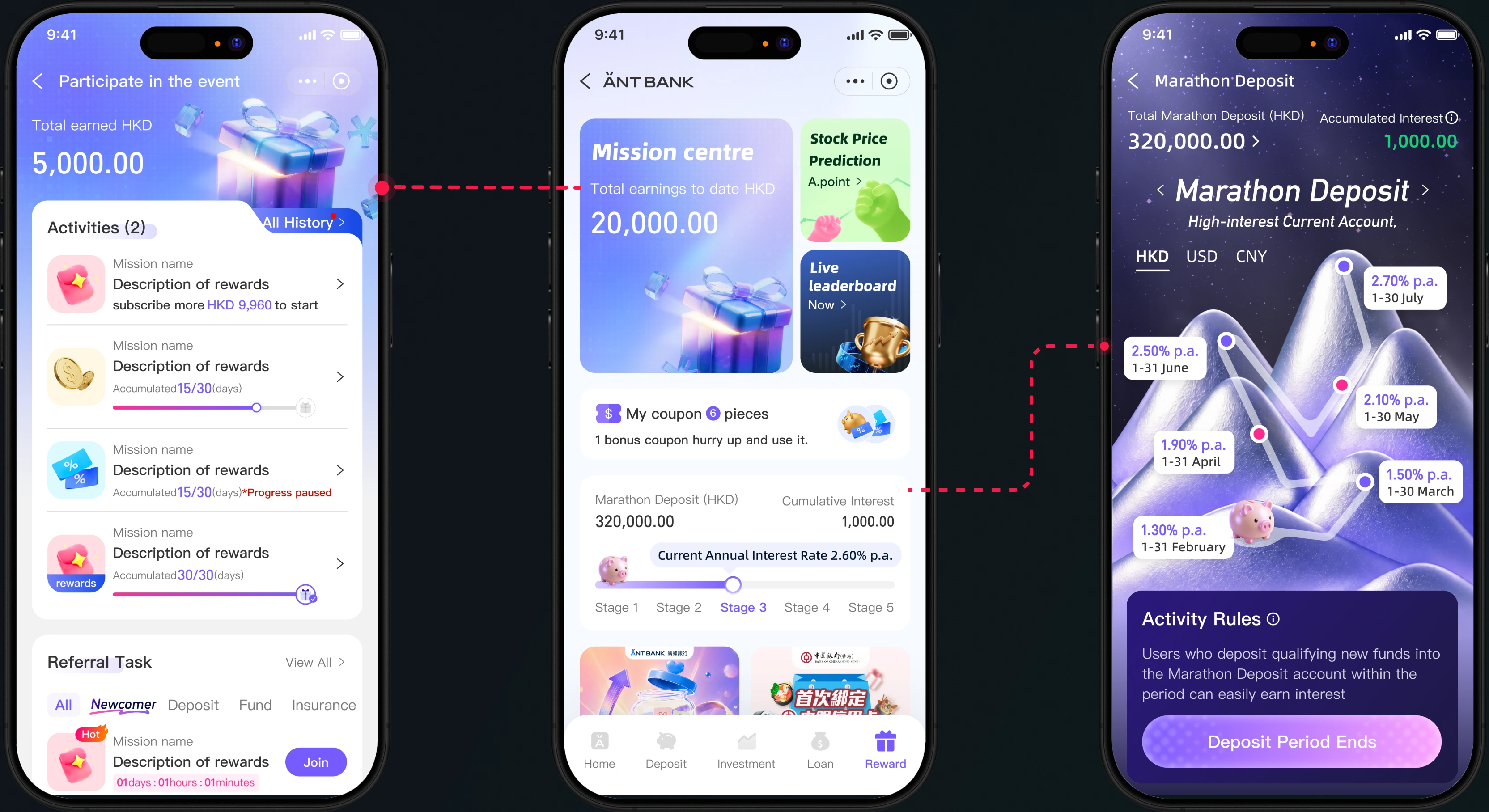
Task CentreTotal Earnings Guess the Rise and Fall Task Real Account Leaderboard Task
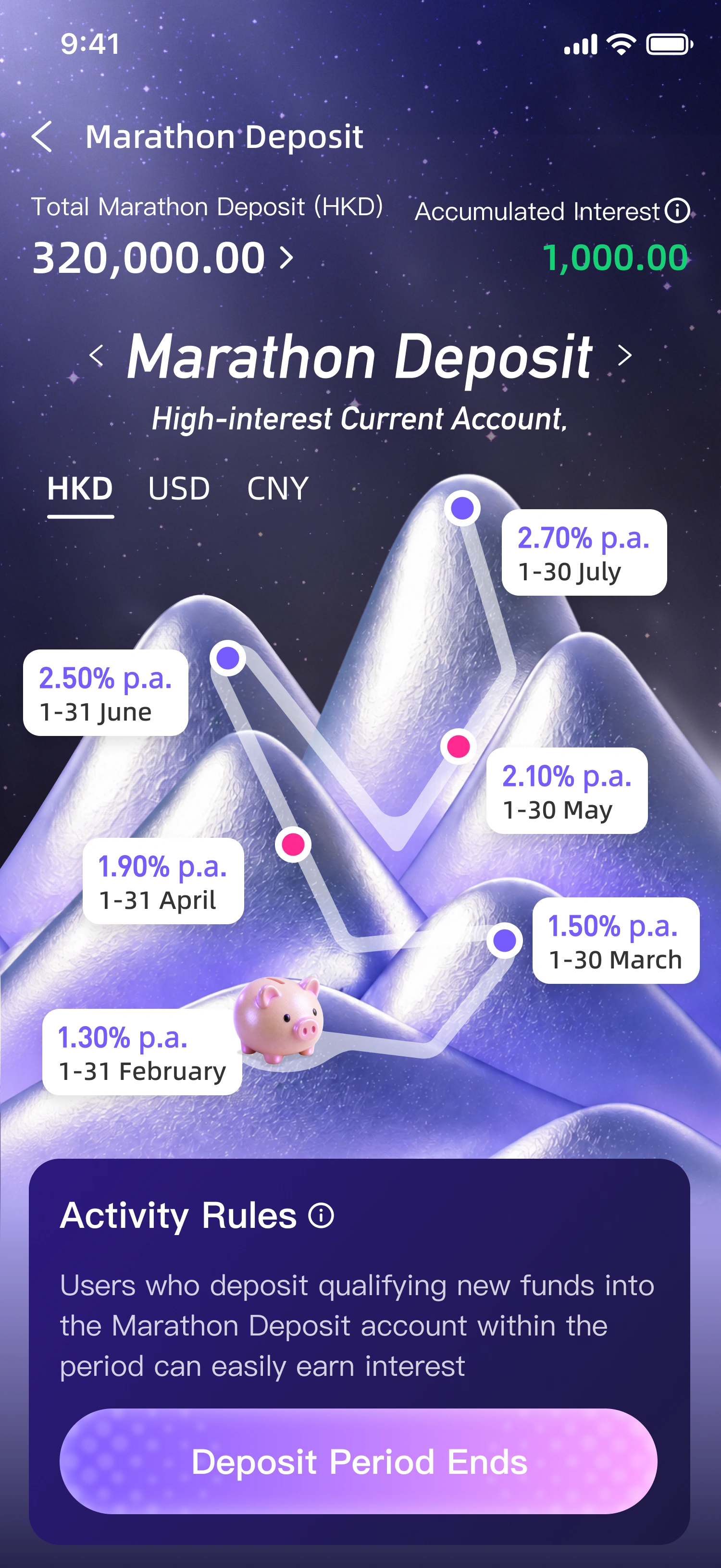
My BenefitsCoupon Reminder Deposit Progress Available Rewards
✦Ant Bank
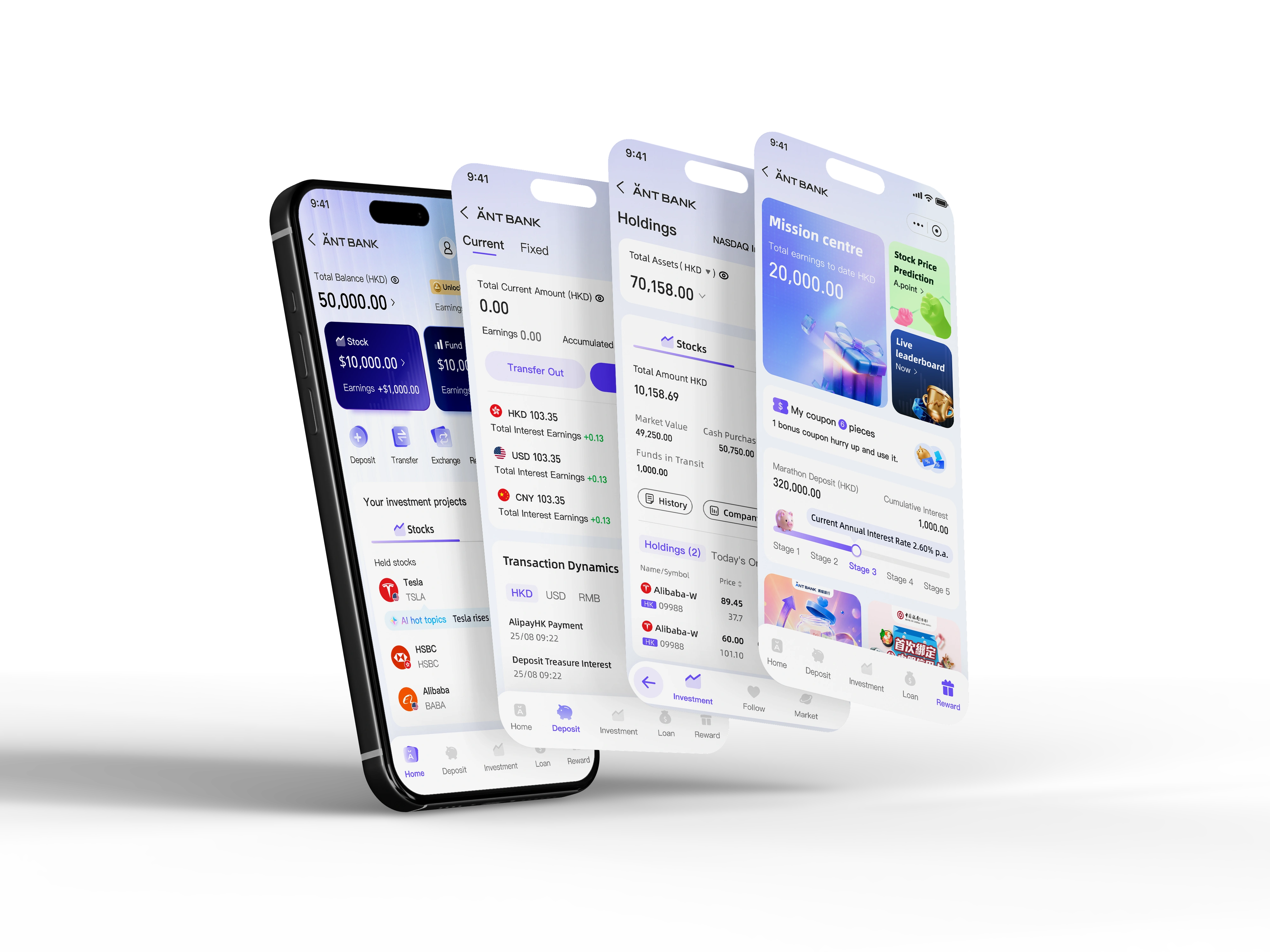
Prioritizes task efficiency and clearer daily banking behavior. Its main change is moving from a long, product-heavy structure to a bottom-navigation model with five focused areas: Home, Deposits, Investment, Loans, and Rewards. The experience puts key user needs first: checking assets, making deposits, reviewing investments, calculating loans, and managing benefits.
Brand new user interface design
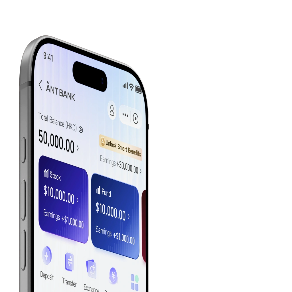
We focus more on your personal wealth than other virtual banks, allowing you to manage your wealth as your primary browsing item. Your user experience is our true core business goal.
Ant Bank
✦Major structural changes
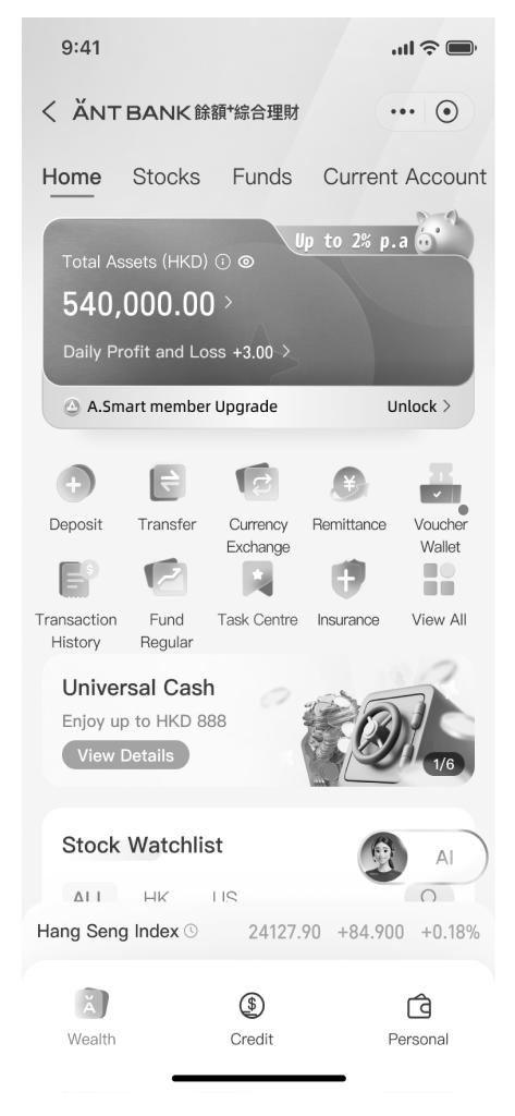
We pivoted from top-heavy tab navigation to an intuitive bottom navigation system as our primary guiding framework. This structural shift aligns directly with natural thumb-zone ergonomics, drastically reducing physical reach fatigue on modern large screens. By consolidating core user flows into persistent, high-frequency entry points at the base of the viewport, we minimized navigation friction and visual noise. Users can now seamlessly transition between key financial services, establishing a clearer mental model and an uninterrupted exploration path.
In the legacy architecture, users navigated financial services via top-anchored category switches. This setup heavily cluttered the homepage header, forced awkward hand readjustments, and buried essential features within deep sub-categories—resulting in cognitive overload and higher drop-off rates during daily operations.
To address these friction points, our qualitative user research and depth interviews revealed a critical need for streamlined taxonomy and instant feature access. Consequently, we completely re-architected our financial service portfolio. By thoroughly categorizing complex offerings into structured functional hubs and embedding them directly into the primary bottom navigation bar, we radically enhanced feature discoverability, reduced task completion time, and built a habit-forming interaction framework.
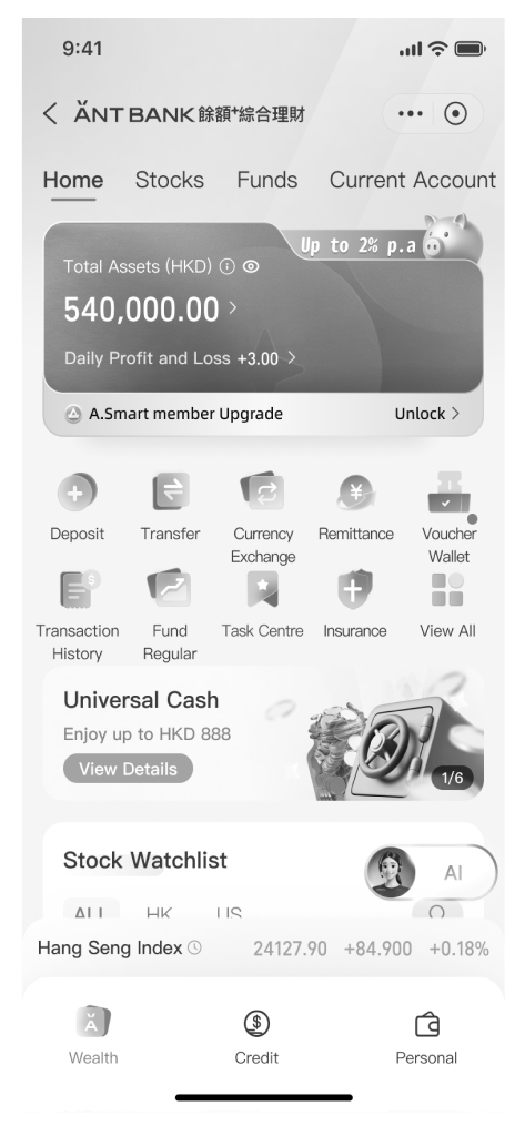
AS-IS
TO-BE
✦Home page
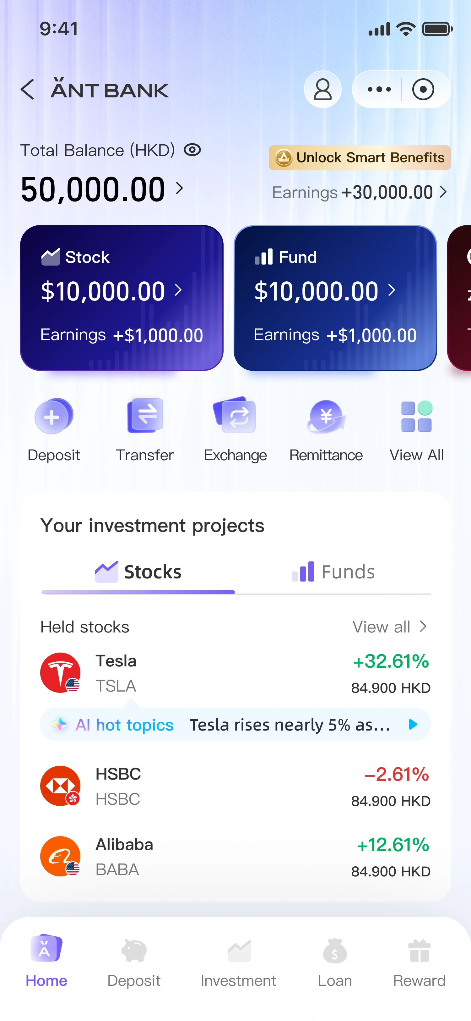
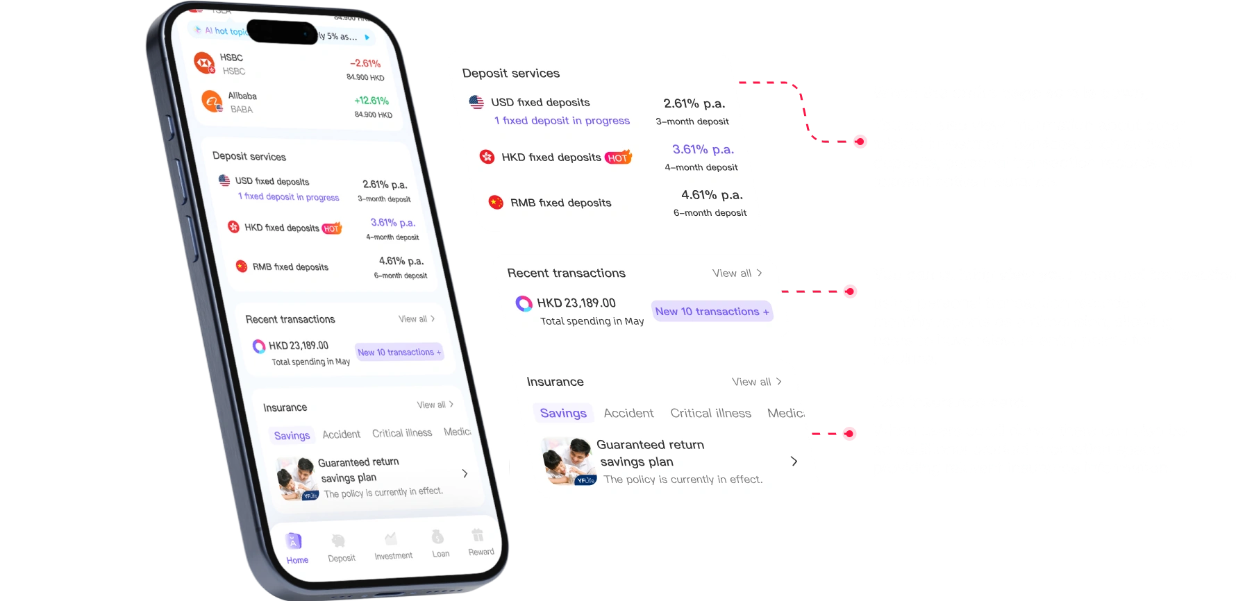
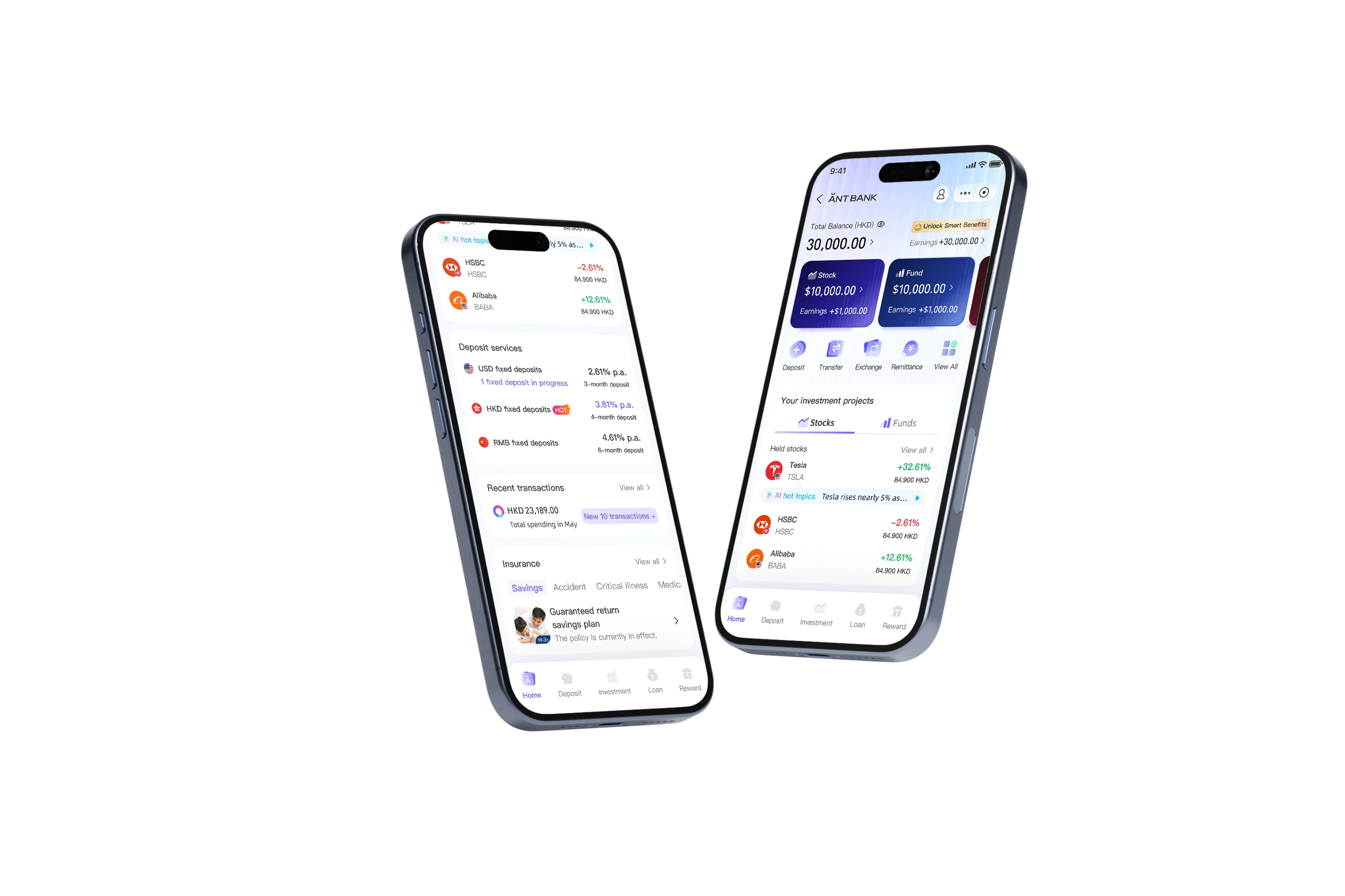
To address the issues of fragmented asset categorization and the need for frequent page switching, the update aims to evolve from a single-function entry point into a clearer, integrated wealth management experience. Our goal is to help users quickly grasp the status of their personal assets and more efficiently view, compare, and manage their investments.
HKD 23,189.00Total spending in MayNew 10 transactions +
Insurance View all ›
Guaranteed return savings planThe policy is currently in effect.›
When the entire page scrolls down,
You can also view information about other related investment services, such as fixed deposits, personal transaction records, and relevant active insurance.
You can quickly view your personal transaction records.
Using personal transaction records or monthly reports as a dimension, allowing users to have relevant entry points for inquiries.
Add insurance card.
When users scroll down, there can also be an additional product promotion space providing relevant insurance information.
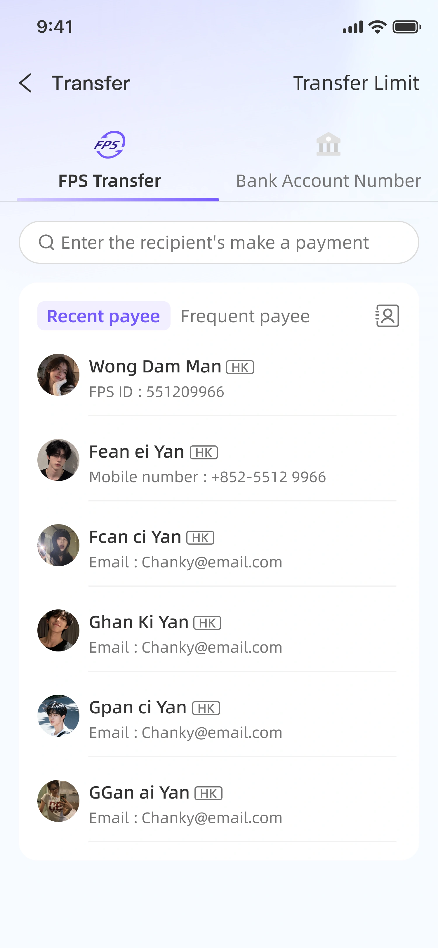
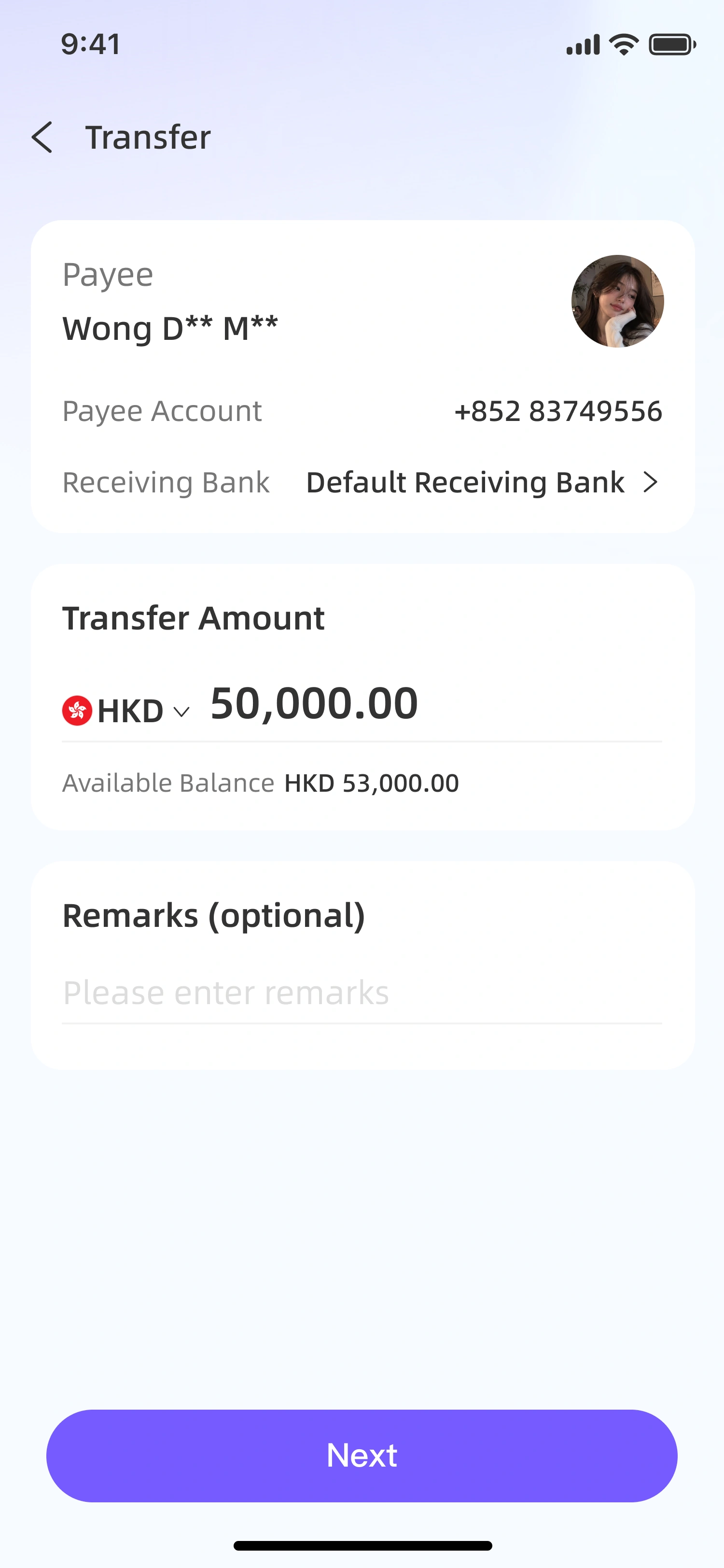
✦Transfer page
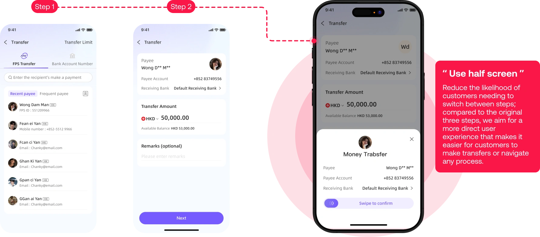
Further optimise the streamlined user experience process, hoping that the overall transaction operations can be confirmed a second time within half a screen.
Step 1Step 2
“ Use half screen ”
Reduce the likelihood of customers needing to switch between steps; compared to the original three steps, we aim for a more direct user experience that makes it easier for customers to make transfers or navigate any process.
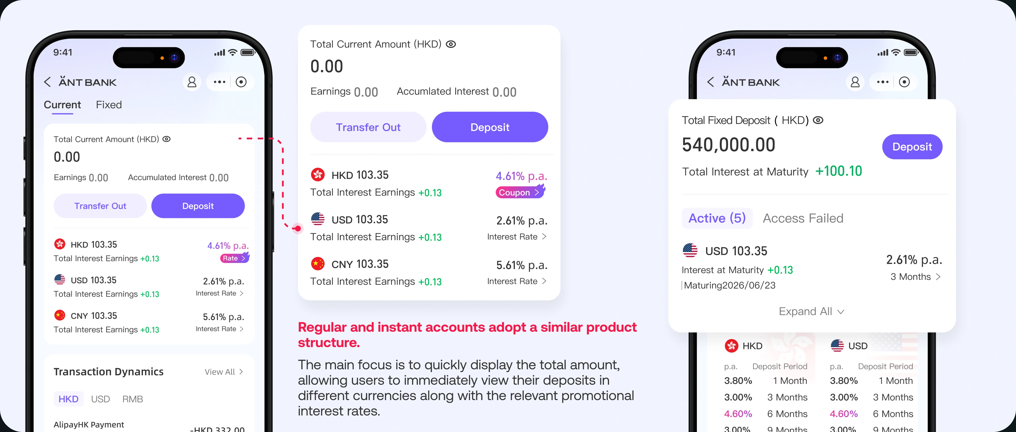
✦Deposit page
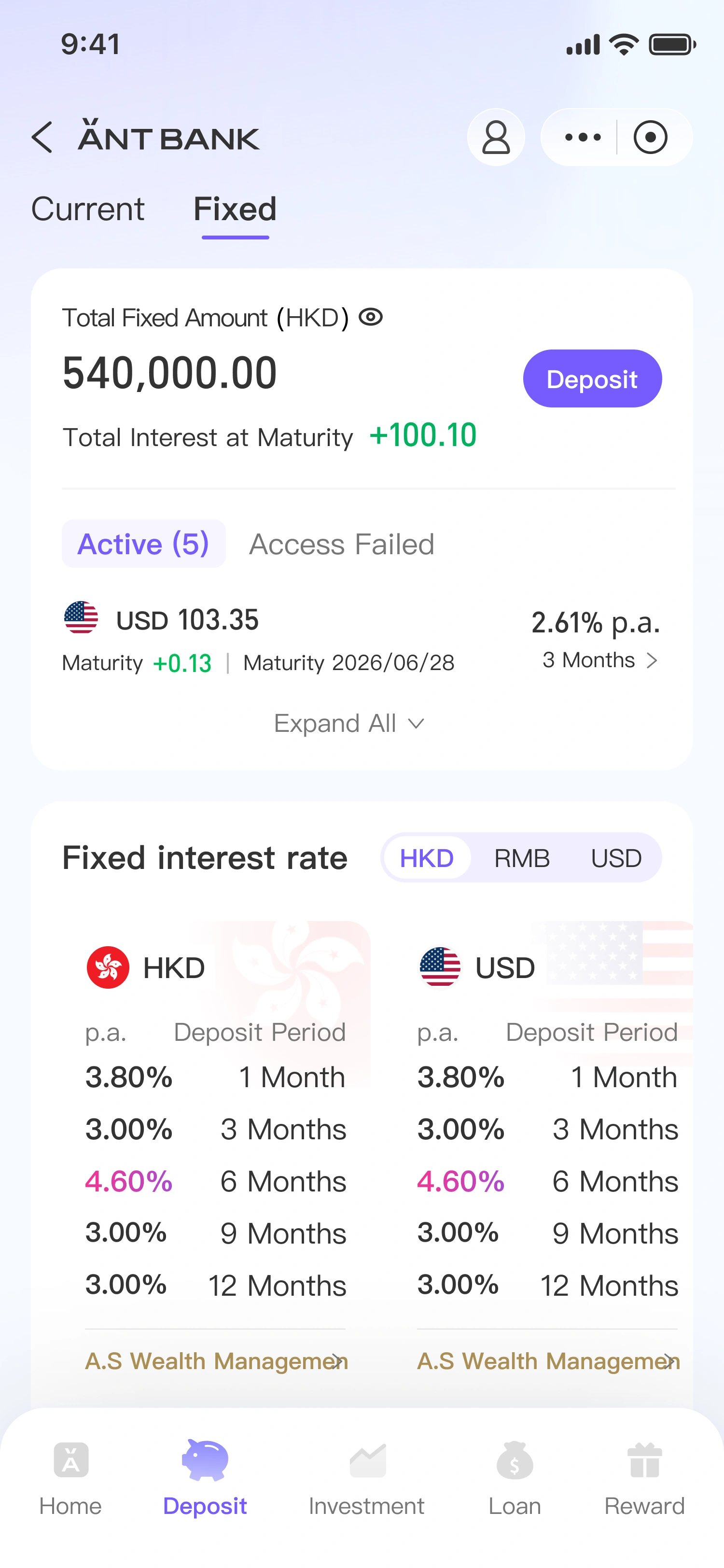
Users can quickly view their fixed-term or current deposits through the top toggle, where they can see their total amounts and the balances in different currencies. Additionally, there will be corresponding user transaction records or a deposit interest rate table below for quick reference. Alternatively, there is a simple pathway to open a new fixed-term investment, and the fixed-term table will also display the best rates to enhance user interest.
Regular and instant accounts adopt a similar product structure.
The main focus is to quickly display the total amount, allowing users to immediately view their deposits in different currencies along with the relevant promotional interest rates.
✦Why
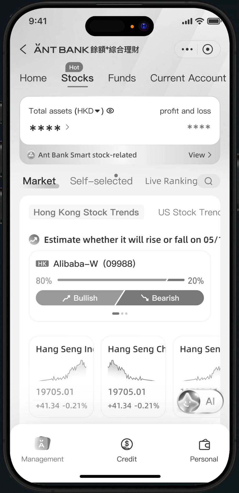
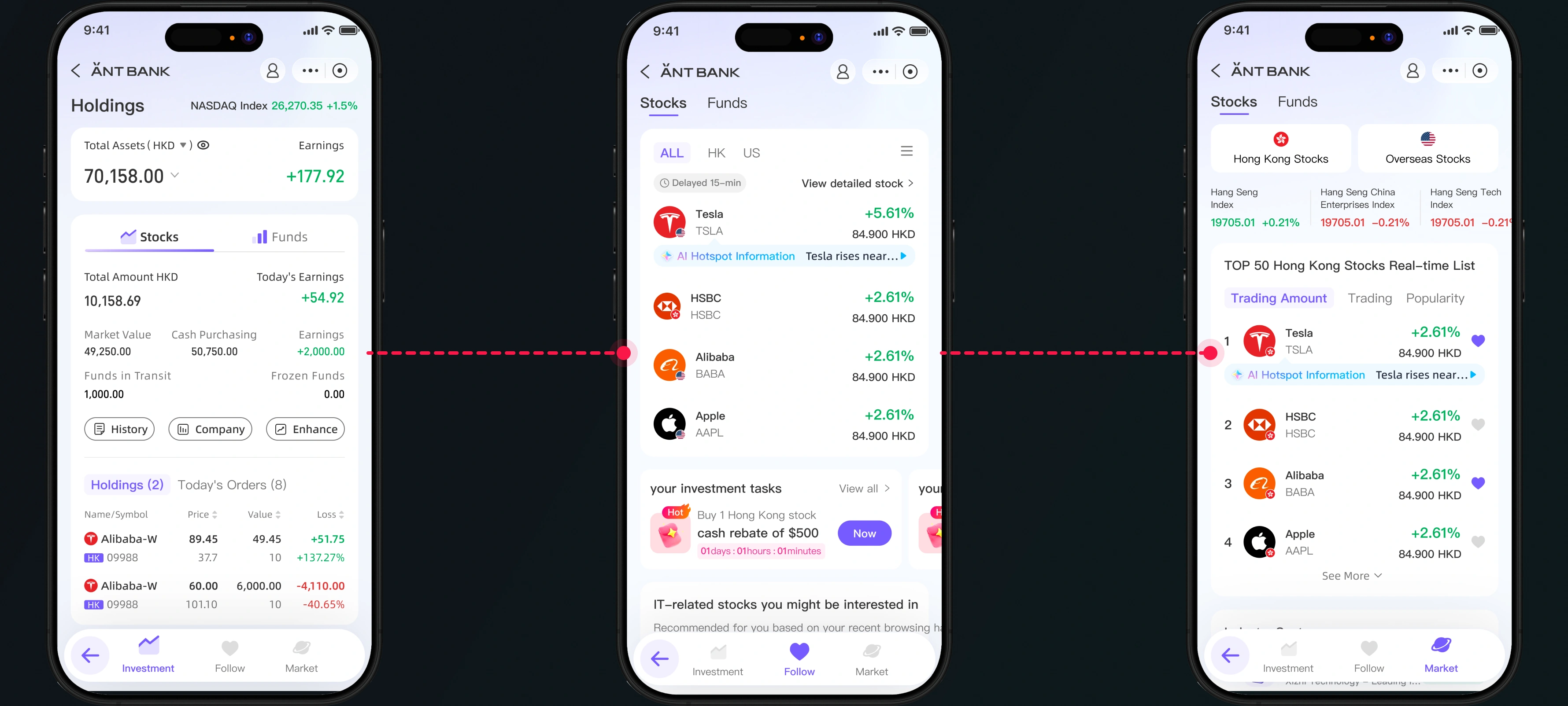
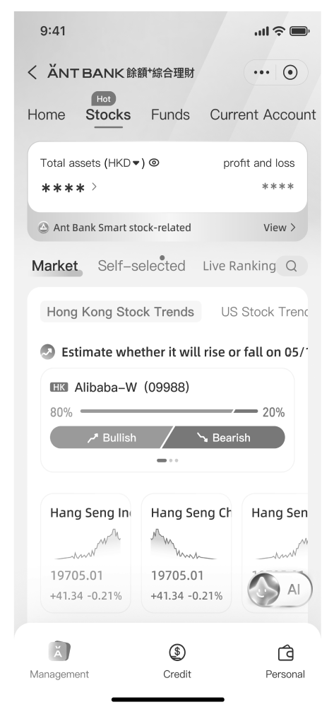
You can see the current online version on the left-hand side, but due to the lack of better options for transitioning to the Netherlands below, a single page is cluttered with a lot of different information, such as the market or stocks you are interested in, which actually requires switching tabs or scrolling to view.
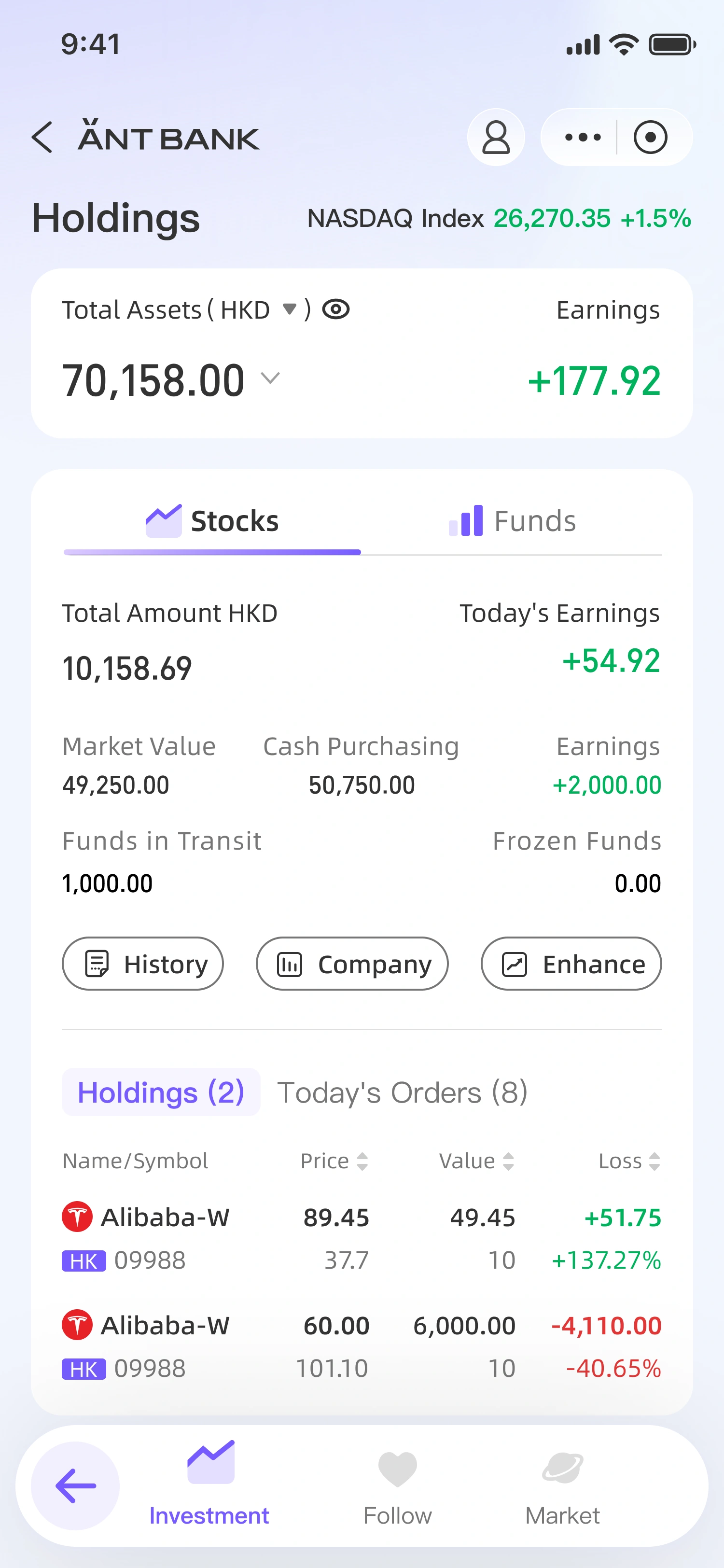
In the new version, we hope that users can quickly and conveniently check their relevant amounts or holdings at first glance, as investment users are more concerned about their own assets in the current environment.
The current placement method in the new version allows for a greater extent of expansion on the overall investment page, as the old version only had three tabs for switching, making it difficult for users to view anything further.
AS-IS
TO-BE
✦Investment
In classification, we distinguish between our holdings, user interests, and the overall market by directly switching among three different dimensions. Within these three distinct dimensions, we can also retain various business areas for expansion, such as the current stock funds, which could later include bonds from different countries.
HoldingsFollow
✦Loan
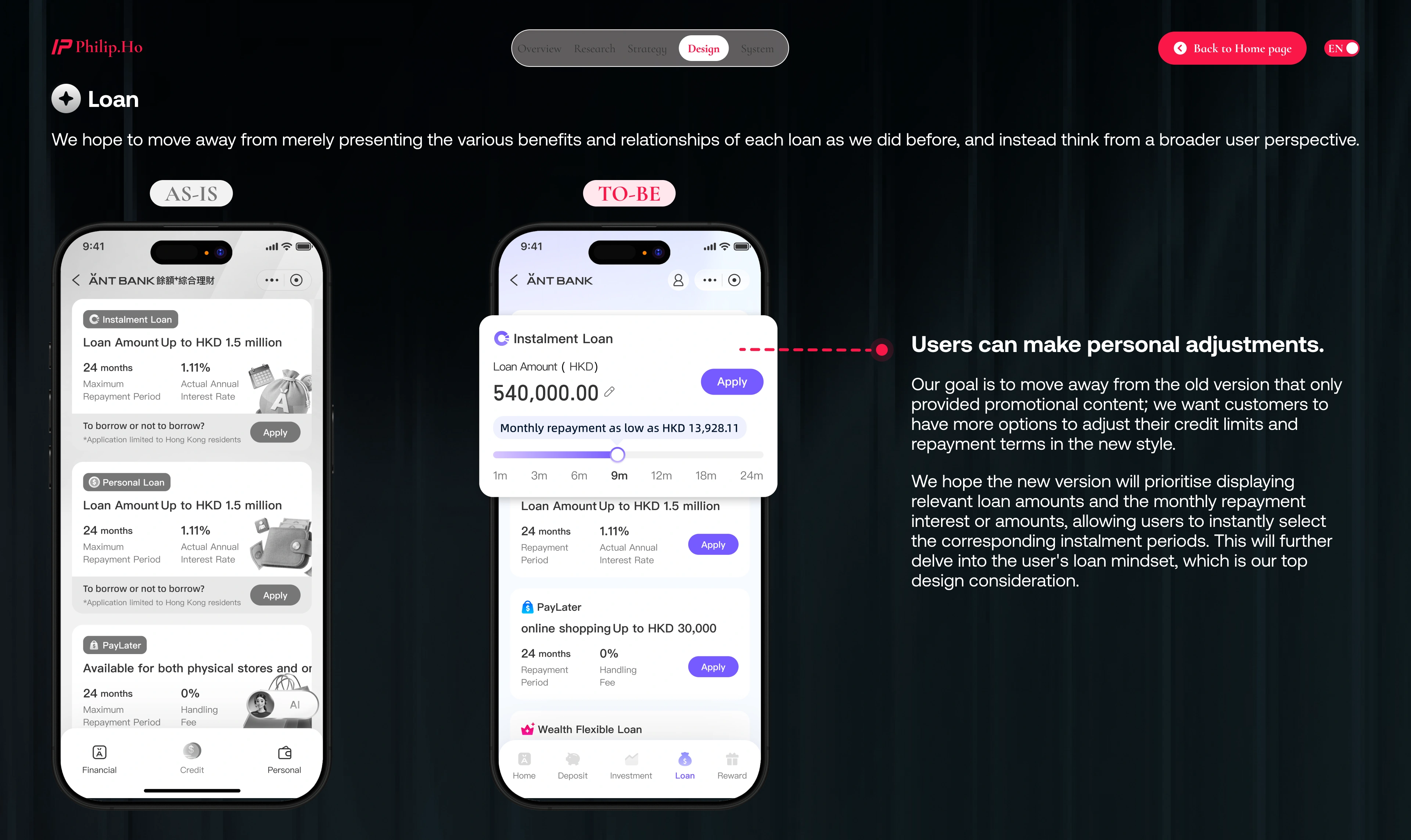
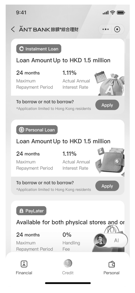
We hope to move away from merely presenting the various benefits and relationships of each loan as we did before, and instead think from a broader user perspective.
AS-IS
TO-BE
Users can make personal adjustments.
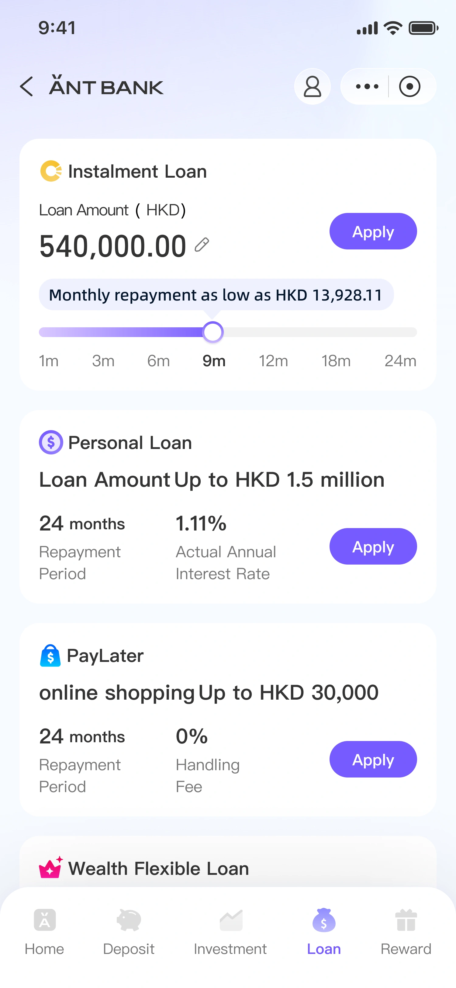
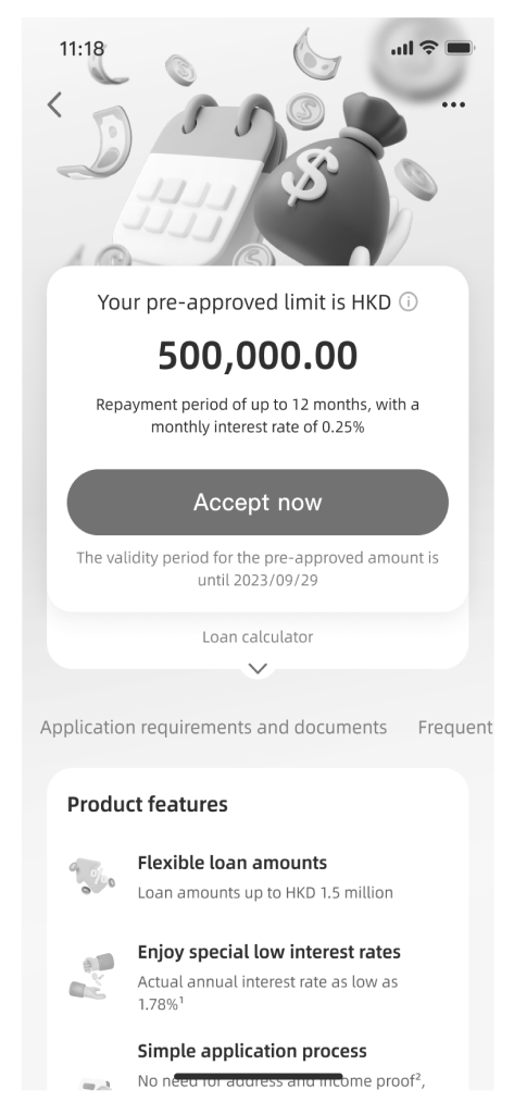
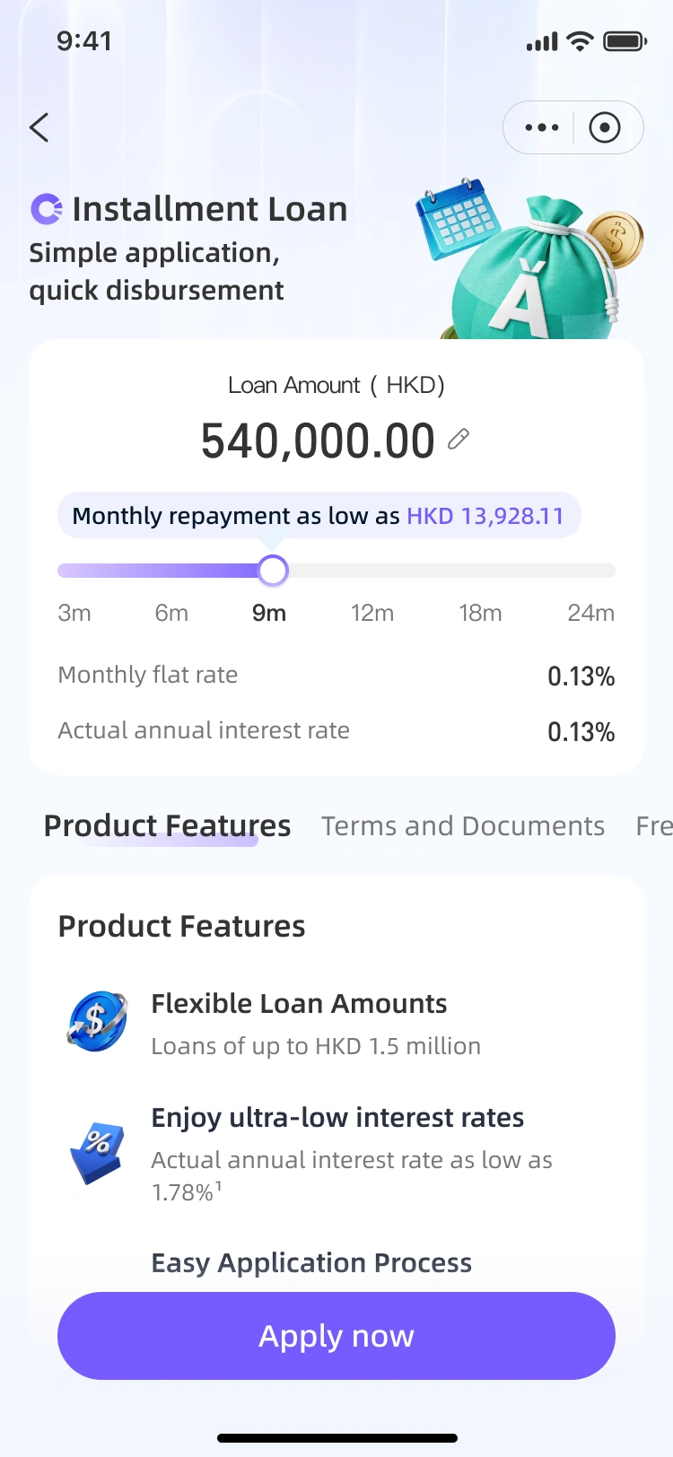
Our goal is to move away from the old version that only provided promotional content; we want customers to have more options to adjust their credit limits and repayment terms in the new style.
We hope the new version will prioritise displaying relevant loan amounts and the monthly repayment interest or amounts, allowing users to instantly select the corresponding instalment periods. This will further delve into the user's loan mindset, which is our top design consideration.
AS-IS
TO-BE
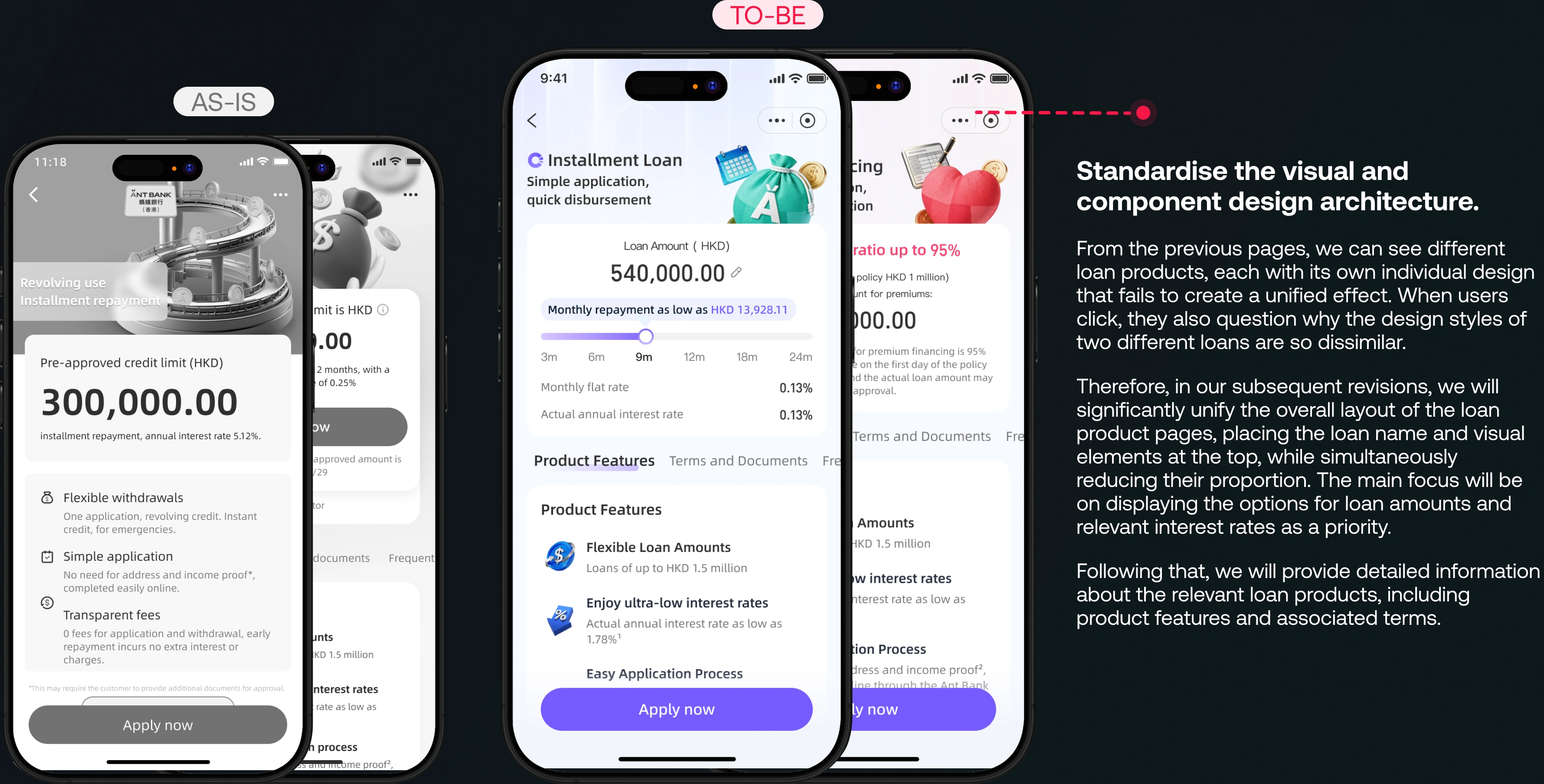
Standardise the visual and component design architecture.
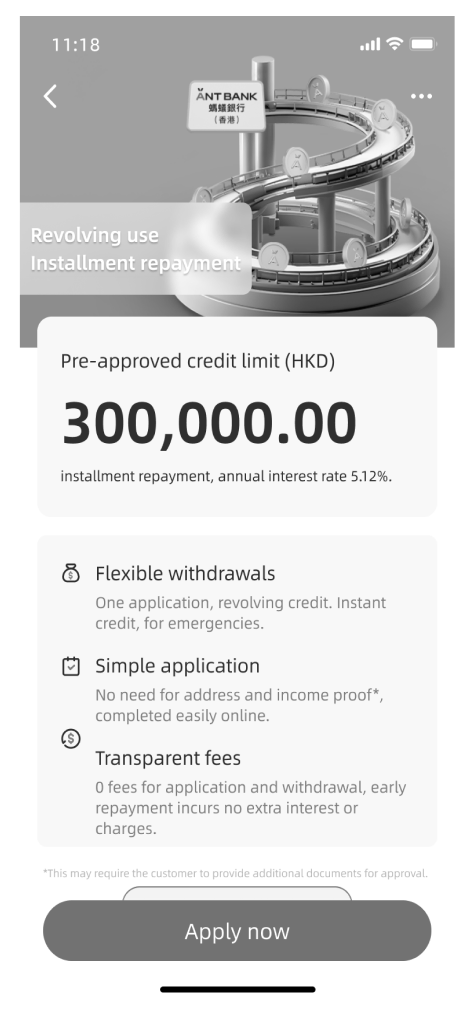
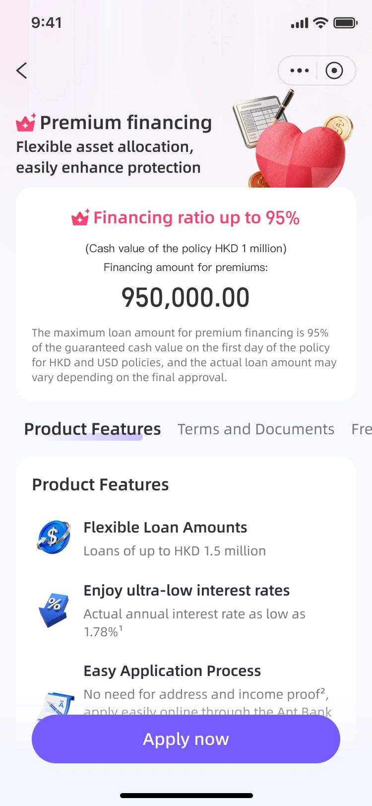
From the previous pages, we can see different loan products, each with its own individual design that fails to create a unified effect. When users click, they also question why the design styles of two different loans are so dissimilar.
Therefore, in our subsequent revisions, we will significantly unify the overall layout of the loan product pages, placing the loan name and visual elements at the top, while simultaneously reducing their proportion. The main focus will be on displaying the options for loan amounts and relevant interest rates as a priority.
Following that, we will provide detailed information about the relevant loan products, including product features and associated terms.
✦Reward page
We hope to manage our different tasks or related activities or promotions effectively on a single page.
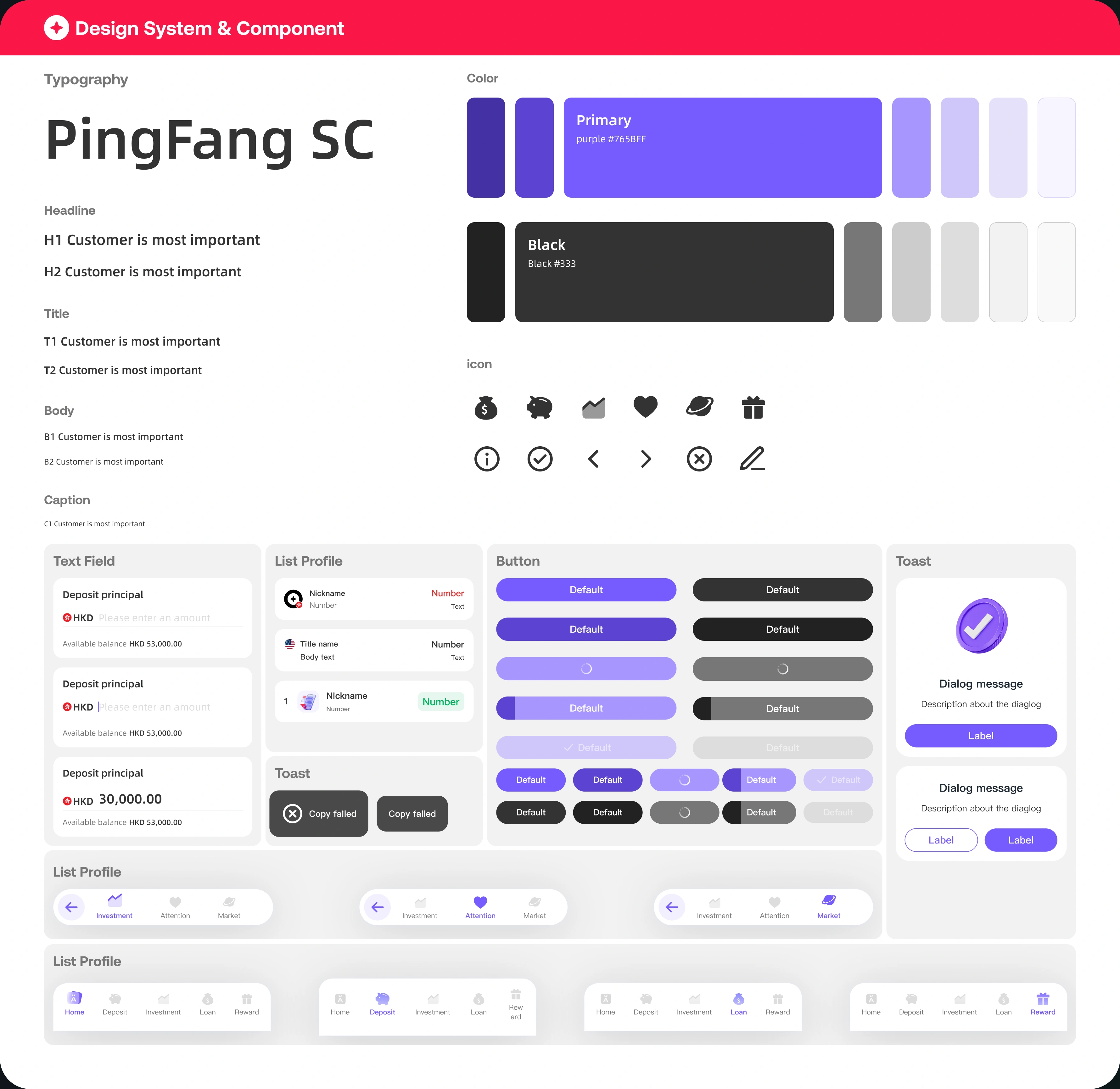
✦Design System & Component
Typography
PingFang SC
Headline
H1 Customer is most importantH2 Customer is most important
Title
T1 Customer is most importantT2 Customer is most important
Body
B1 Customer is most importantB2 Customer is most important
Caption
C1 Customer is most importantColor
Primarypurple #765BFF
BlackBlack #333
icon
i●‹›×✎
Text Field
Deposit principal HKD 30,000.00Available balance HKD 53,000.00
Deposit principal HKD Please enter an amount
List Profile
NicknameNumber
Title nameNumber
Toast
ⓧ Copy failed
Button
Toast
✓Dialog messageDescription about the dialog
← ⌁ ♡ ◉
← ⌁ ♥ ◉
← ⌁ ♡ ◉
⌂ ● ⌁ ● ✦
⌂ ● ⌁ ● ✦
⌂ ● ⌁ ● ✦
“Ho Kwun Yiu ”
Product Structure Design User Experience/User Interface Design Design System


 Back to Home page
 01
01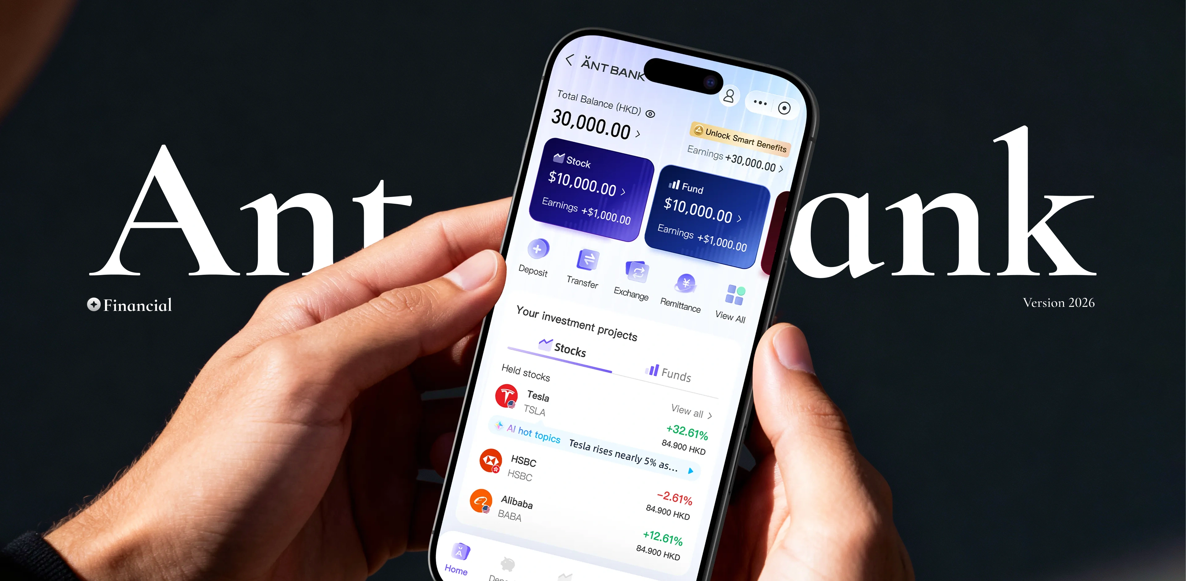


 02
02 03
03 05
05
 😐😐🫠🙂😖
😐😐🫠🙂😖